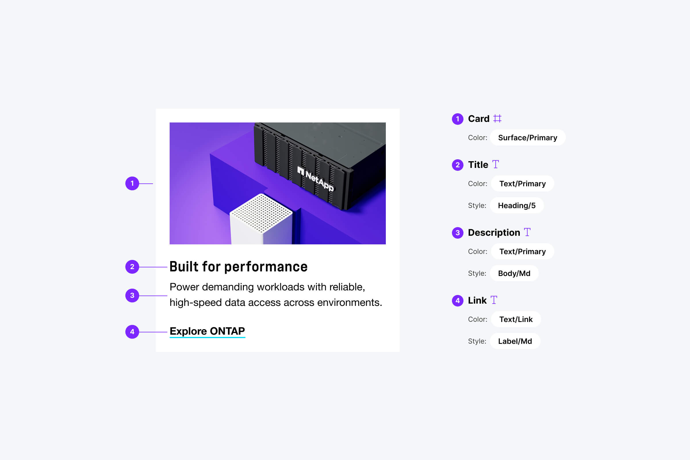
NetApp —
Design System
Enterprise System Rebuild

In Progress

Currently leading end-to-end creative direction for the full rebrand of NetApp.com, replacing the agency-led visual expression shown below with a more cohesive and intentional in-house system.

While this next-generation direction is not yet public, it establishes a more cohesive and elevated visual language that will serve as the foundation for the future design system.

The work below reflects the system built to scale the original brand rollout. While it introduced structure and consistency, the visual language itself was constrained and lacked polish, limiting how effectively the system could evolve.

Project Scope

Overview
Led the translation of an externally defined brand into a scalable digital system across NetApp.com, supporting over 10,000 pages and a global, multi language experience.
Challenge
The brand was defined externally without clear guidance for how it should function as a digital system. The work needed to scale across thousands of pages within a constrained visual framework, while preserving all existing components and functionality.

While not the visual direction I would have chosen, the opportunity was to bring consistency and usability to a complex platform at scale.
Approach
Built a structured system to bring cohesion to the experience. Defined layout patterns, standardized components, and aligned design and engineering on how the system is applied in production.


* Select visuals and naming conventions have been modified to protect proprietary information. Work shown reflects representative system applications or public-facing experiences.

Structural Rebuild

Visual Translation
Translated the new brand into a cohesive digital language by defining how color, spacing, imagery, and components should behave across the experience.
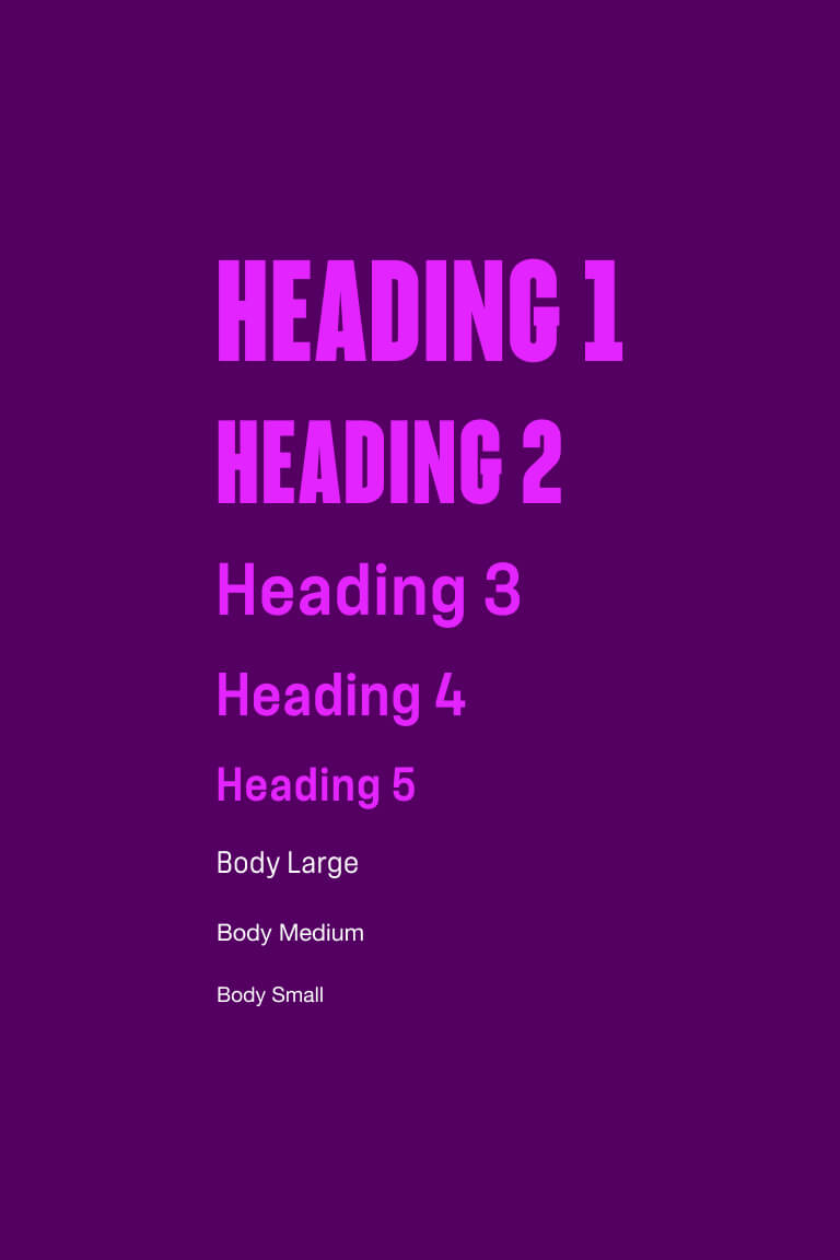
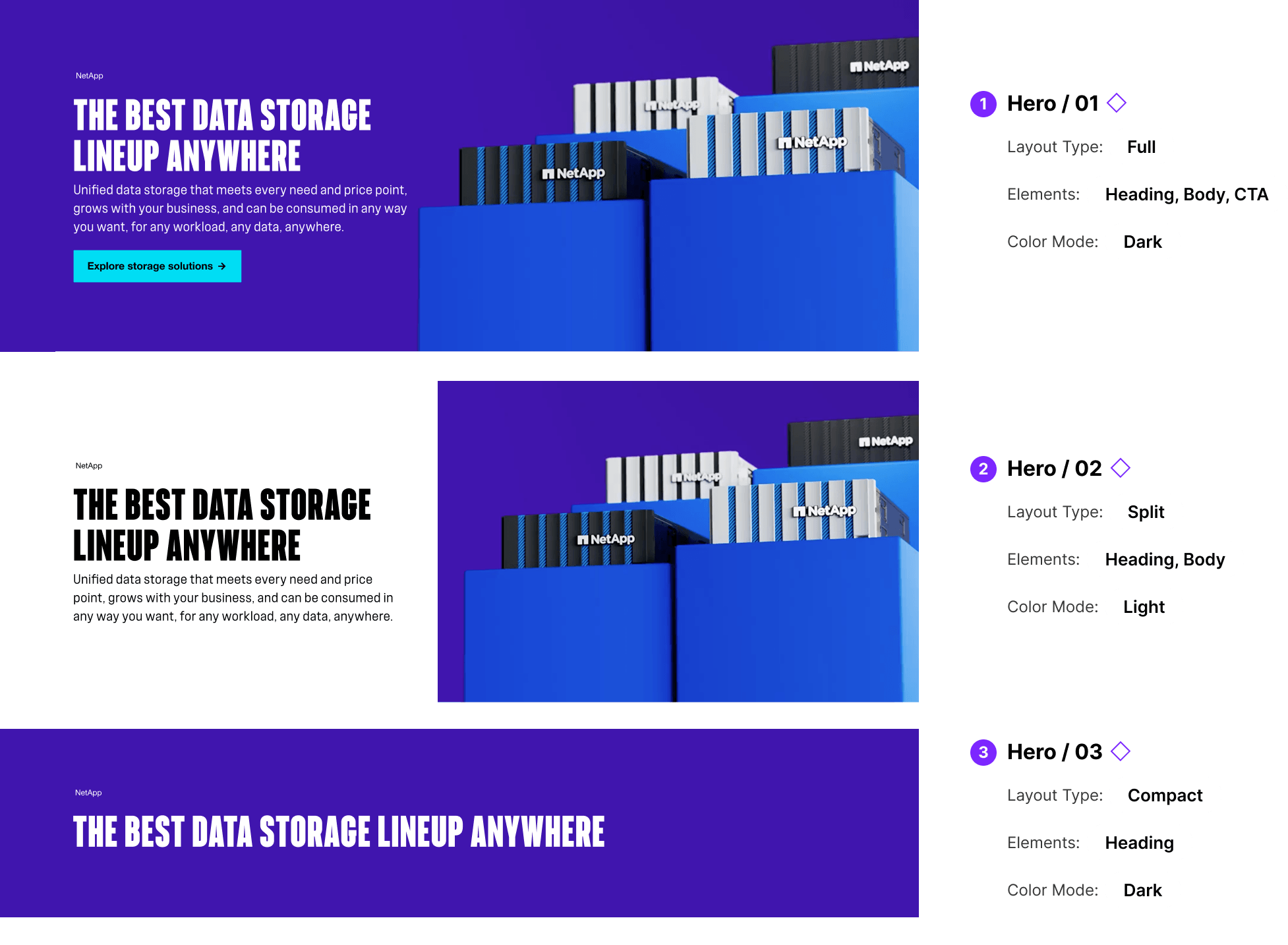
Hierarchy
Defined clearer rules for hierarchy across headlines, body content, and supporting elements to improve readability and flow.
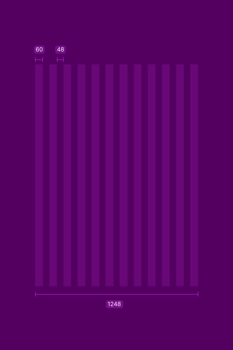
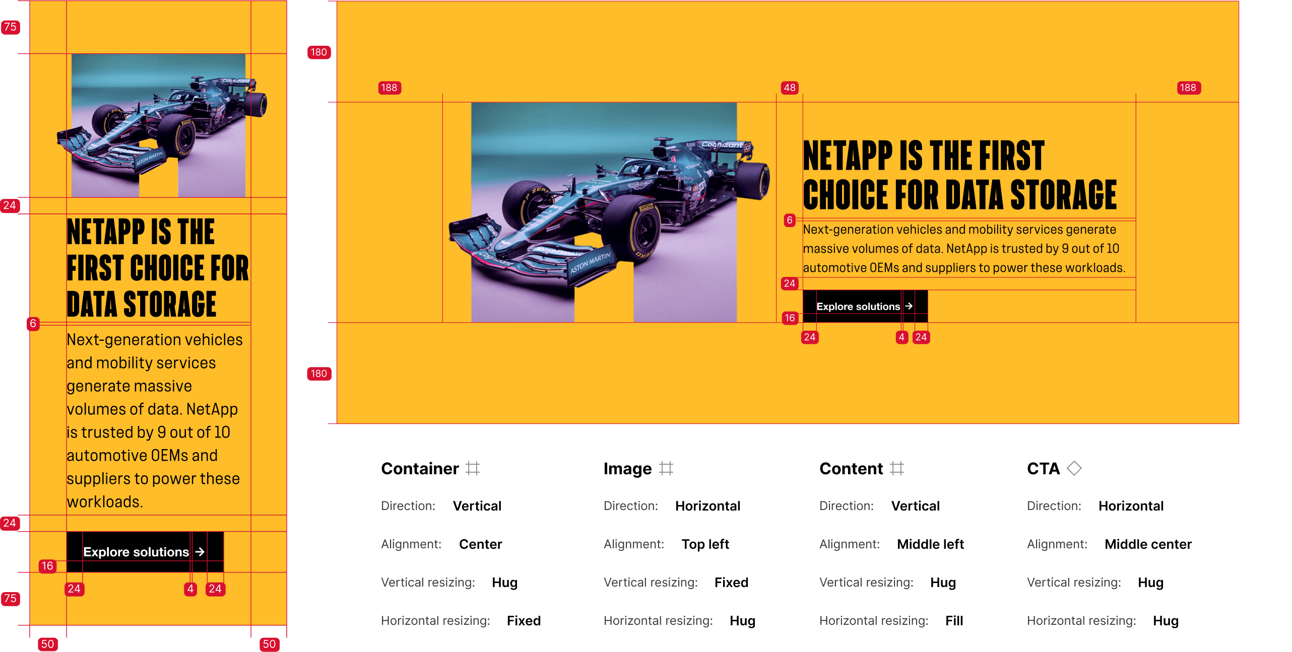
Grid
Replaced edge to edge layouts with a structured grid and spacing system. Introduced clear separation between elements, improving clarity and creating a flexible foundation that scales across page types.
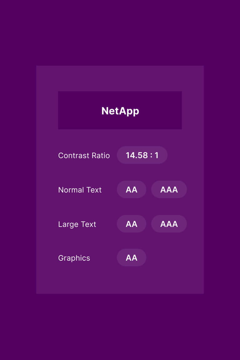
Accessibility
Integrated accessibility into the system through contrast, typography, and spacing decisions to support more legible and inclusive experiences.
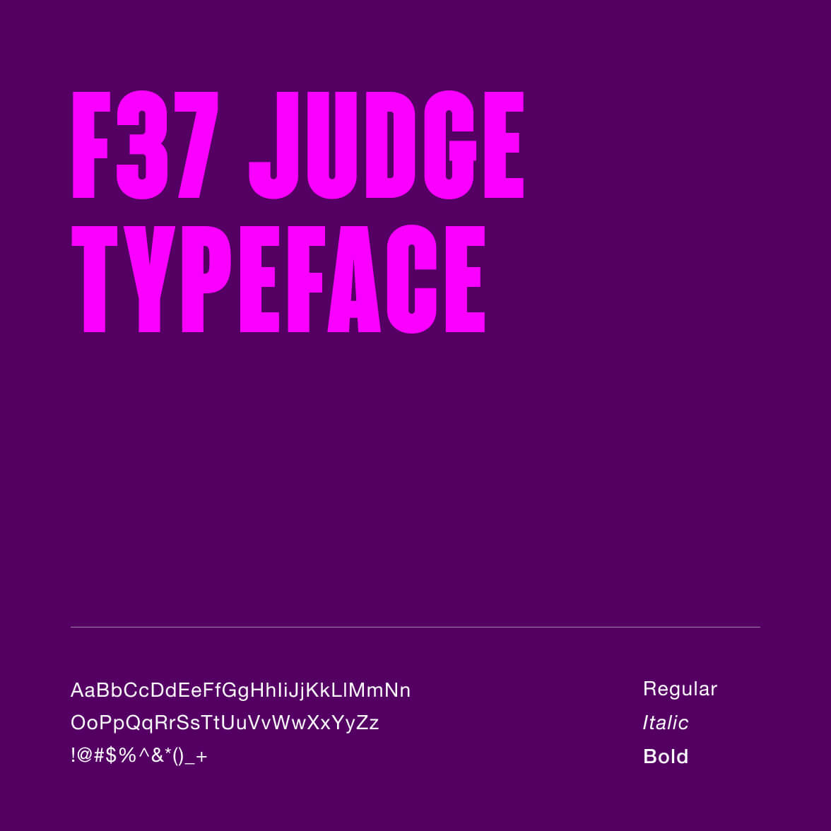
Typography
Developed a typographic system that supports 10 languages, including double byte character sets, maintaining consistent hierarchy and readability across regions.

System Architecture

Properties
Structured component properties in Figma enable controlled variant switching across layout, content, and theme. This allows designers to explore options without detaching instances or breaking system constraints.
Composition
Components are built using flexible layout patterns that support full, split, and compact configurations while maintaining consistent structure and spacing.
Tokens
Tokens scale from base to semantic to component, ensuring consistent color, spacing, and typography across themes and component variants.

Usage Governance

Editorial Guidelines
Defined editorial guidelines for layout, content length, and structure to improve consistency across pages.
Image Standards
Established image standards for sizing, cropping, and exporting to ensure consistency, performance, and quality across the site.
Change Management
Introduced change management practices in collaboration with design, engineering, and cross functional teams to maintain system integrity as the site evolves.

Development Alignment

Specifications
Defined detailed, responsive component specifications across desktop, tablet, and mobile to support accurate implementation and reduce ambiguity in development.
Audit
Partnered with engineering to audit existing components to identify and remove inconsistencies, redundancies, and one off implementations.
System Parity
Established alignment between Figma and production to ensure the system behaves consistently across design and code.

Outcome

The rebuild transformed a fragmented marketing site into a structured, governed system. Layout patterns were standardized, undocumented variants removed, and accessibility embedded into component logic, creating a foundation that supports consistency across a global platform spanning brand, campaign, and product experiences.

Impact

100
%
Adoption
100 percent adoption across internal design, project management, stakeholders, and external agencies.
10k
+
Pages
10k+ marketing pages unified under a standardized system, bringing structure and consistency to a global ecosystem.

Up Next

Currently leading a ground-up digital rebrand of NetApp.com, establishing a cohesive, future-facing visual language and bringing digital brand ownership in house.