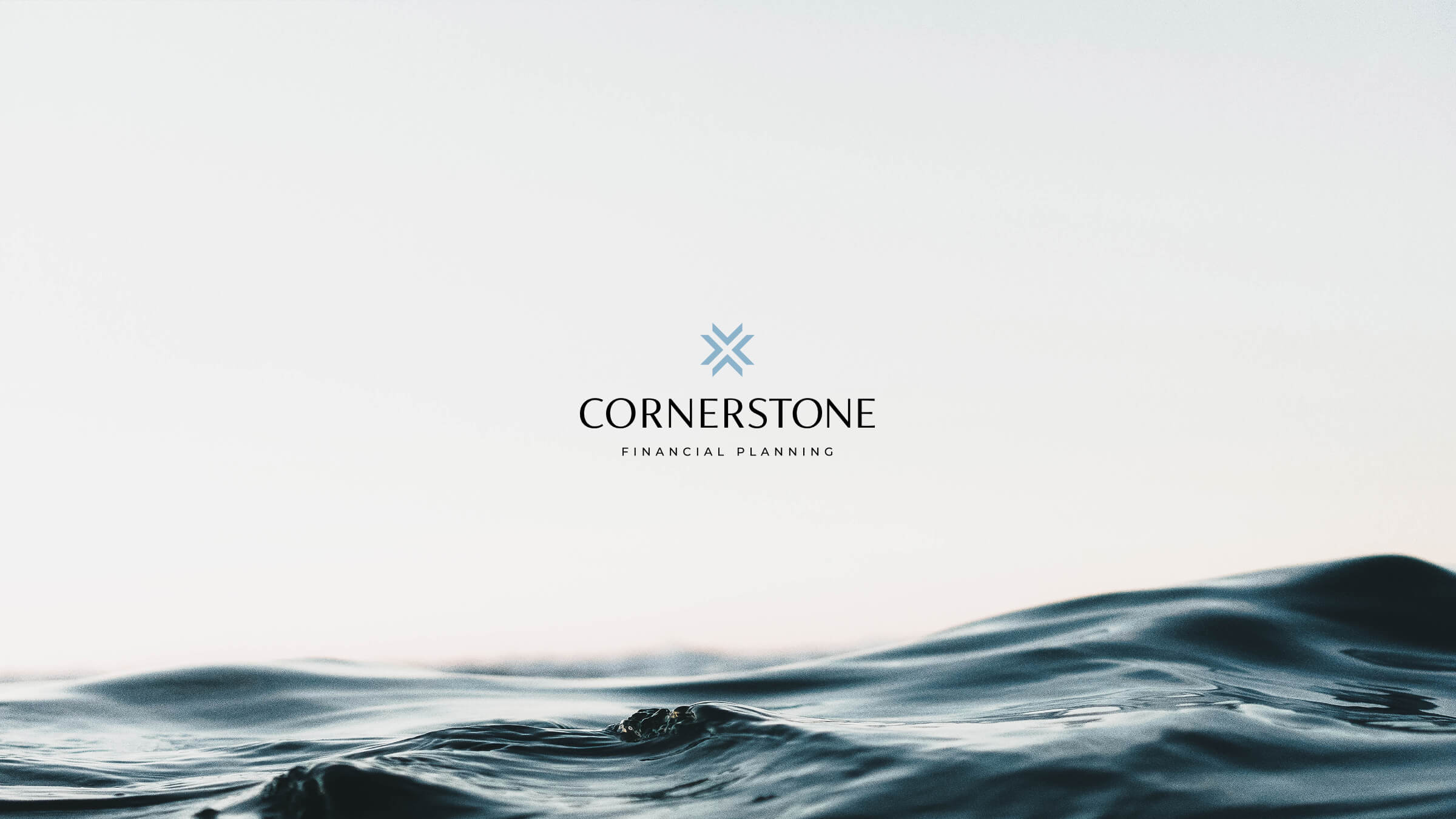
Cornerstone — Brand & Website
Identity System and Digital Experience

Project Scope

Overview
Led a full repositioning across brand and digital, resulting in 2x organic traffic and a 30% increase in qualified leads.
Challenge
Cornerstone’s digital presence undersold the sophistication of its advisory model. Messaging was fragmented, services were difficult to navigate, and the visual system did not reflect the level of quality required for high net worth clients.
Approach
Redefined the brand foundation and translated it into a scalable digital system that clarified structure, elevated the visual language, and built a flexible component system to support growth.

Visual Direction

Three distinct visual directions were explored to test tone and range, each examining a different balance of warmth and authority. The final direction is grounded in restraint, natural light, and a sense of calm confidence, reflecting the emotional outcome of financial planning rather than the mechanics behind it.

Identity

Logo
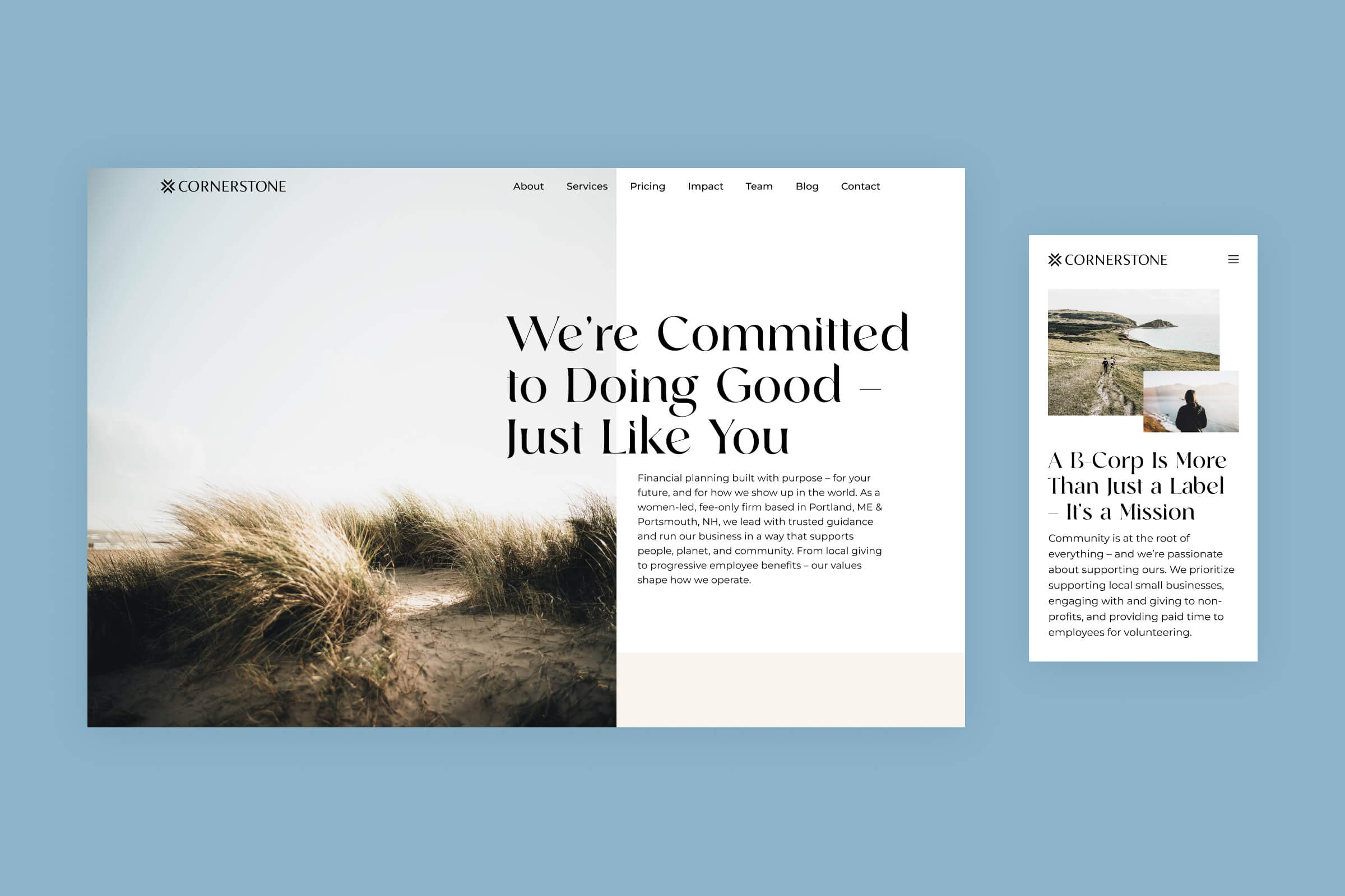
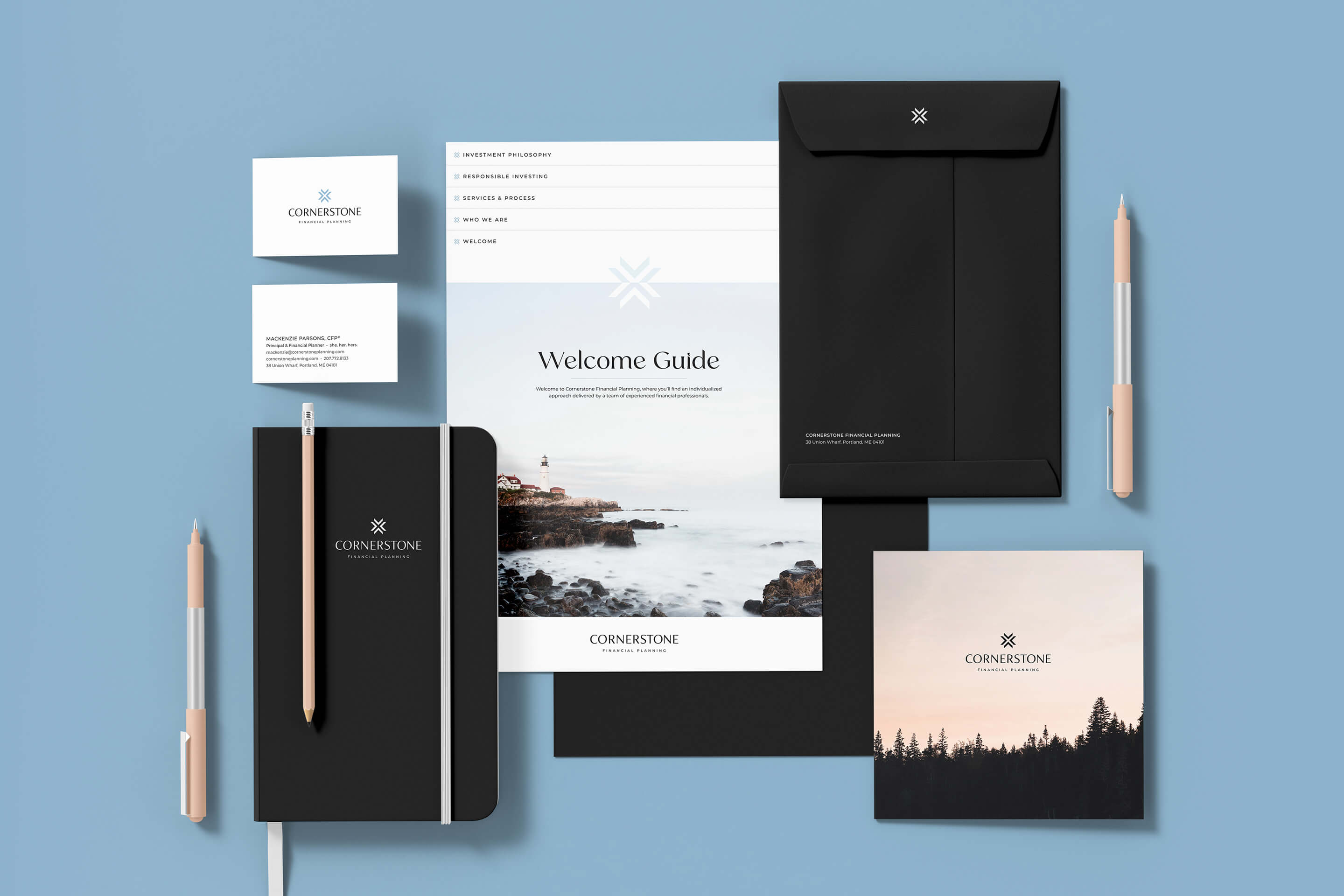
Four corners converge to form a grounded foundation. The geometry signals structure, partnership, and stability. The mark functions as both a primary logo and a scalable element used across the broader system.
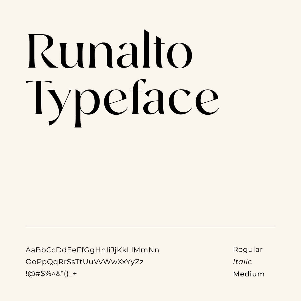
Typography

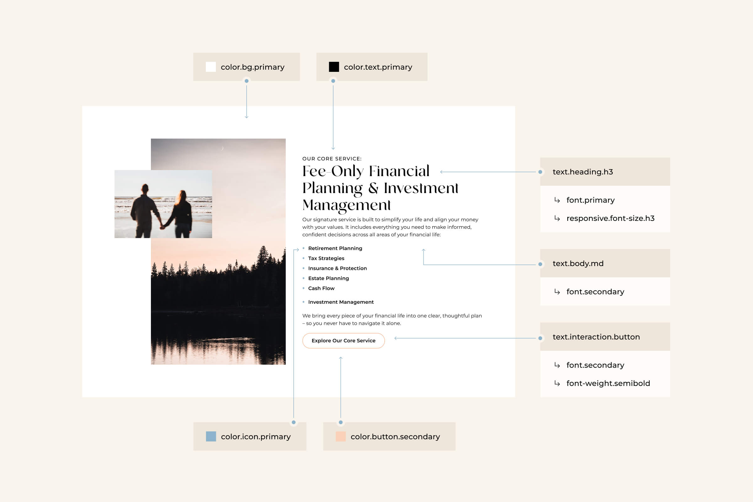
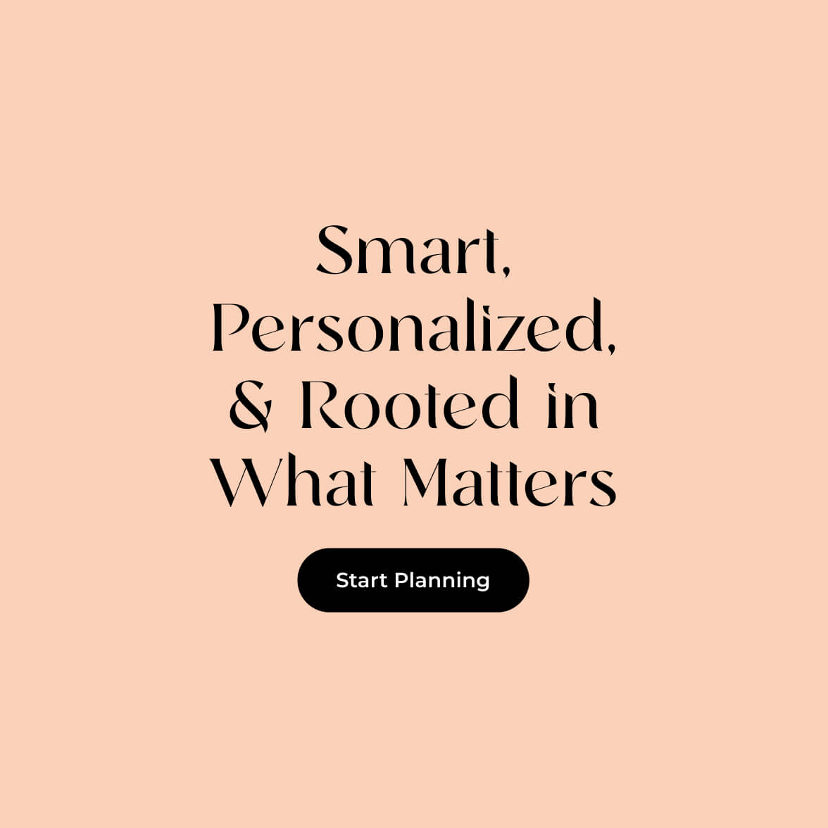
Developed a typographic system that balances warmth and precision. A refined serif introduces personality, while a clean sans serif ensures clarity and usability across digital applications.
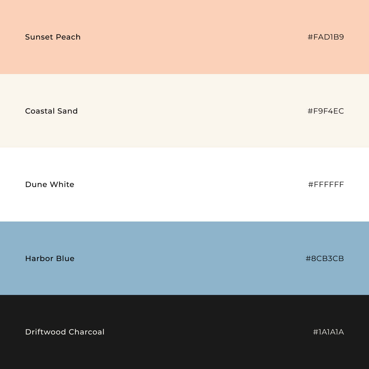
Color
Introduced a restrained palette inspired by the New England coastline. Muted blues and grounded neutrals create a calm foundation, with subtle warmth to add approachability.
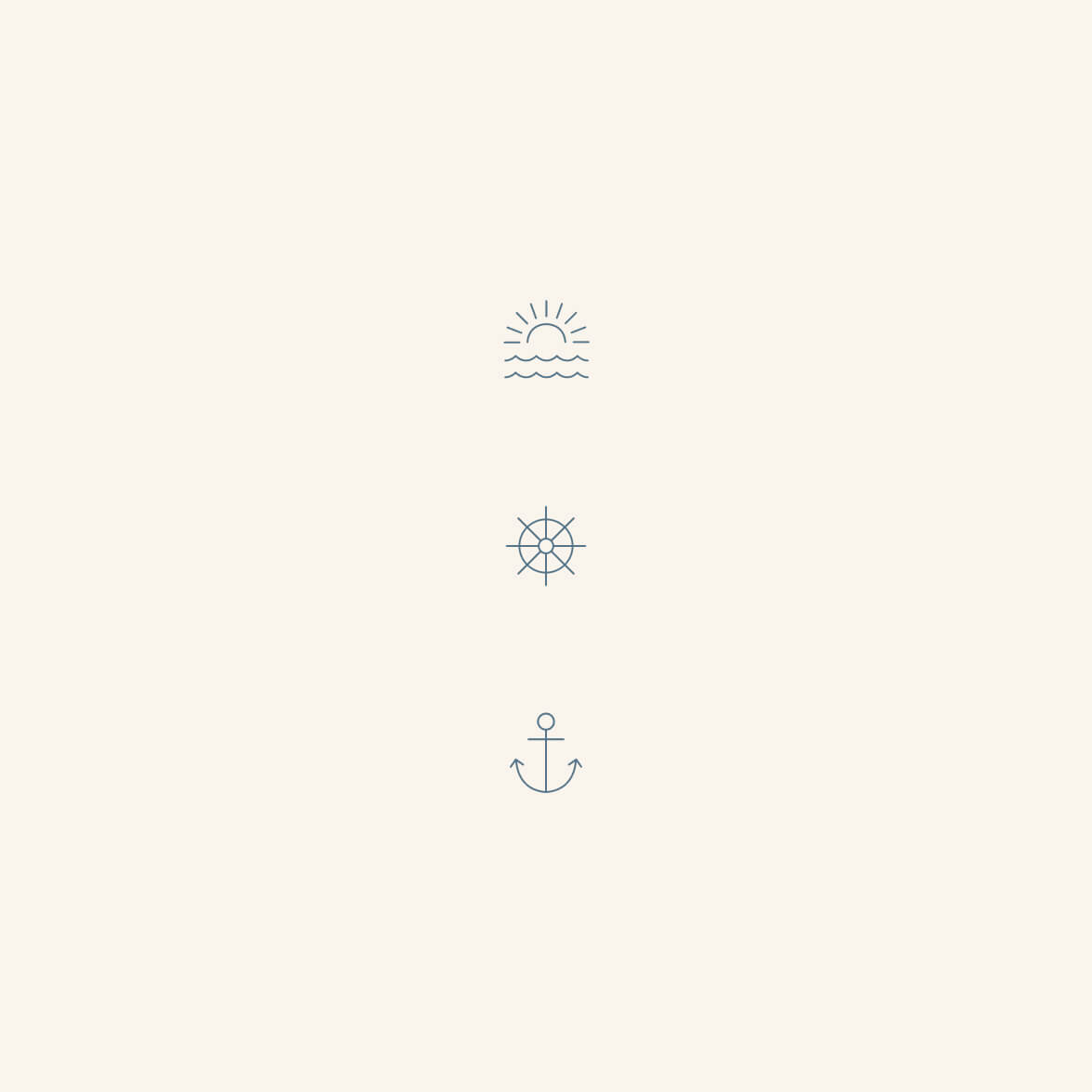
Photography
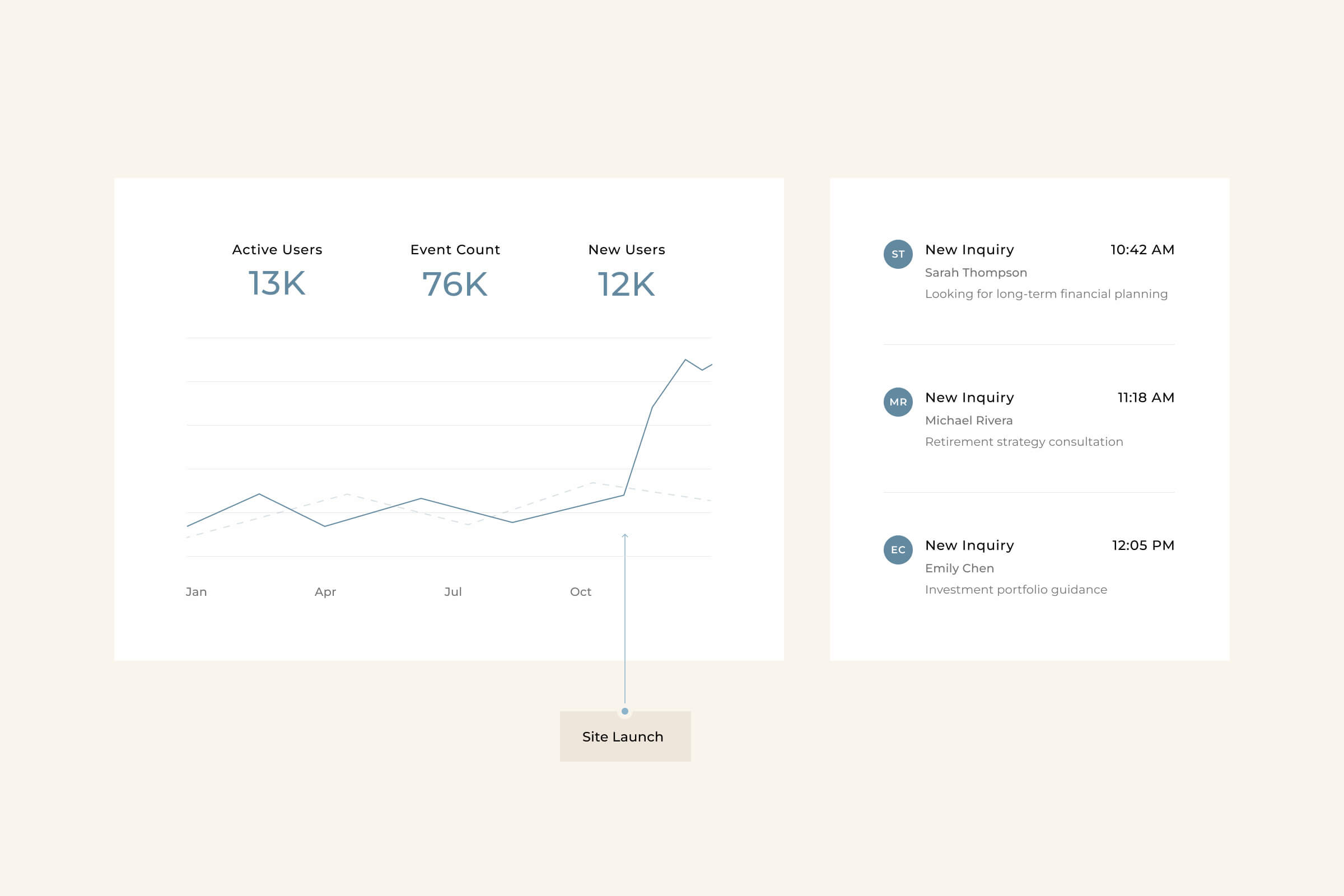
Replaced generic financial imagery with photography that reflects how clients want to feel about their future. Natural environments, open water, and real moments create a sense of clarity, freedom, and control.

Structure

Information Architecture
The site architecture was restructured across navigation and pages to better prioritize services and clarify entry points. Redundant pathways were removed and hierarchy was simplified to improve wayfinding and strengthen positioning.
Messaging
Content strategy and narrative hierarchy were developed alongside the new brand direction, in collaboration with a copywriter, to establish a clear and consistent voice.
Modular Framework
Wireframes and modular components established a scalable page structure, creating a development ready foundation that can extend across future pages.

System

System Implementation
Tokens were structured from base to semantic to component, establishing a scalable system. Variables and components were translated from Figma into Webflow, ensuring consistency across typography, color, and spacing.
CMS Infrastructure
Custom CMS collections were built for blog content and team profiles, allowing internal updates without ongoing development support.
Motion & Interaction
Subtle on load and scroll based motion was introduced across the site, reinforcing brand sophistication without compromising performance.

Outcome

The redesign repositioned Cornerstone as a confident, high-end, values-driven advisory firm. The system brought alignment across brand and digital, strengthening perception and supporting measurable growth.
“This finally feels like us. The brand feels confident, refined, and true to how we serve our clients. We’re proud to share it because it finally represents the standard we hold ourselves to.”

Impact

2x
+
Organic Traffic
Organic traffic more than doubled post launch, reflecting improved search visibility and positioning.
30
%
Qualified Leads
Qualified lead rate increased by 30 percent, indicating stronger intent and better audience alignment.

Extensions

The identity extends beyond the website into print collateral, onboarding materials, email communications, and environmental signage. Its modular structure ensures consistency across digital and physical touchpoints.

Up Next

Search Strategy
Phase one focused on migrating all existing blog content as-is to stabilize the platform. Phase two will introduce a structured SEO framework to address content sprawl and support long-term organic growth through clearer taxonomy, internal linking, and content hierarchy.
Reading Experience
The initial blog reflects a legacy structure. Phase two extends the identity system into a refined, scalable long form reading experience with improved hierarchy and readability.